A guide to pastels
This essential guide uncovers all the delightfully different ways you can apply pastel shades within your kitchen design – giving you the confidence to explore a broader range of colour palettes.

An introduction to pastels
Surprisingly versatile and distinctly transformative, pastels have the ability to turn a drab, utilitarian space into something truly special.
They bring with them positive affiliations with wellbeing, meaning the application of these playful tones can invigorate us and arouse feelings of joy and excitement within the interior space.
This trend is also closely associated with the vitality of the spring season; welcoming in a new lease of life and providing a greater sense of optimism – often bringing with it a childlike response that can inspire a carefree approach to the way they’re applied.


Pastels in the kitchen
When it comes to pastels, there are no right or wrong answers. These colours are effortlessly flexible and can be incorporated into a multitude of interior schemes, sparking our creative minds whilst simultaneously soothing us.
In many ways, pastel tones are becoming the new neutrals.
They create the ideal opportunity for self-expression, whilst composing timeless, considered spaces that are gentle on the eye and calming for the mind.


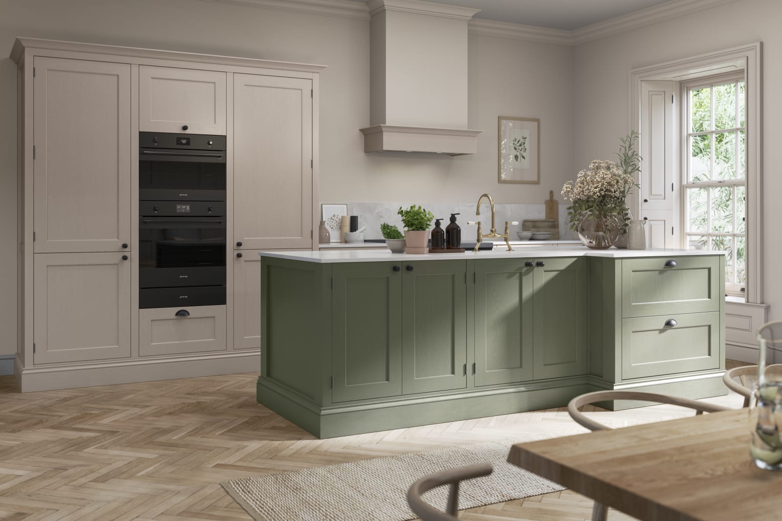
With the addition of delicate wooden flooring and artisanal homeware, for example, we can counterbalance the sugary appearance of pastels, effectively grounding a space by mimicking the colour structures found in nature.
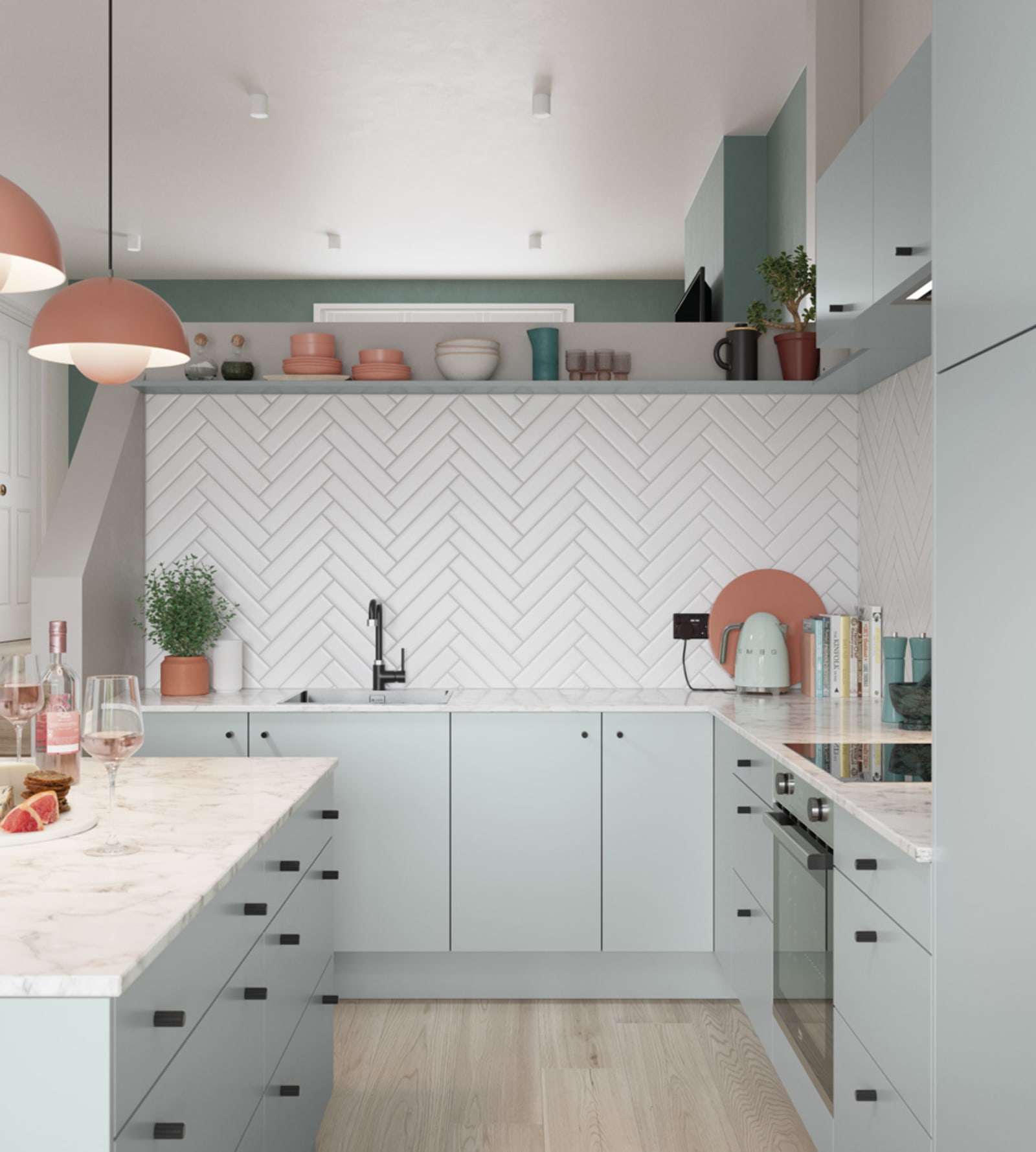
Pair any arrangement of these muted sorbet colours with black handles and sleek appliances for a masculine, contemporary approach. Or combine them with earthy neutrals and raw clay textures to create a dreamy, suburban haven.
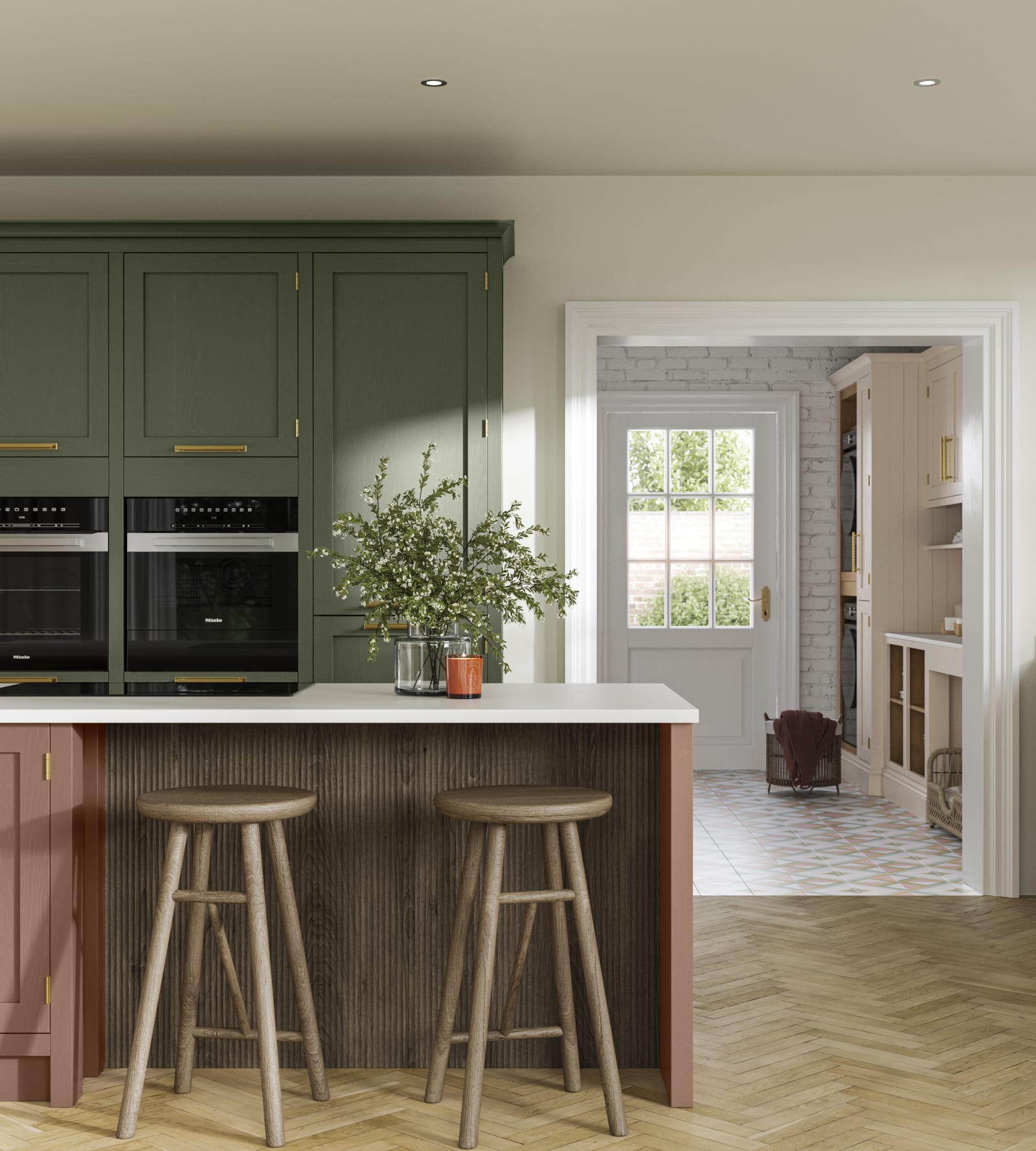
Warm terracottas and reassuring browns maintain feelings of familiarity and warmth, creating a space that is comforting and nurturing to the soul.
Potted planting is a simple and effective way to introduce an element of contrast without overpowering or clashing with these dynamic shades.
When designing your space, consider textural layering within elements of the decor to provide additional depth and interest. Whether it be crisp, white herringbone tiles for a contemporary setting, or perhaps a tonal floral wallpaper for a slightly more traditional scheme.
Some of the many colours within our range that make this trend so popular are Seagrass, Sky, Shell and Misty moors.
Brought together in a dual-tone design, the warmth of the soft pink balanced against the cool of the muted green creates a striking gender-neutral appeal which features as a common theme throughout 2022’s overarching interior trends.
Warm ambers and striking teal accents can be used to cut through the visual landscape of these interiors, adding a pop of colour and a sense of playfulness.

No matter how they’re applied, pastels are bound to create a statement and they hold an unapologetic presence that’s simply perfect for the kitchen. Browse our curated range of paint-to-order colours for more inspiration here or book a free Design Consultation with your personal Magnet designer to start creating your own pastel-inspired kitchen.
Psst... Don't miss out!
Want front-row access to the latest design trends and seasonal offers? Subscribe to be first in the queue.
This site is protected by reCAPTCHA and the Google Privacy Policy and Terms of Service apply.
Thank you for signing up!
More from {{slotProps.categoryNames}}
Are you in the trade?
Sign up for a Magnet Trade account and get exclusive benefits & discounts
Which? Best Buy
Lifetime cabinet guarantee
Sign up for emails
Subscribe now for exclusive limited-time offers, exclusive updates and design trends.
Thank you for signing up!
This site is protected by reCAPTCHA and the Google Privacy Policy and Terms of Service apply.


