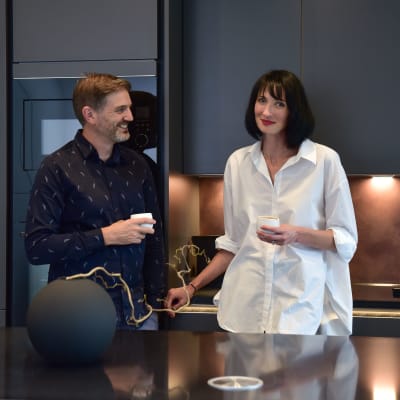
Anna & Andrew's monochrome kitchen



Get the look


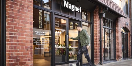
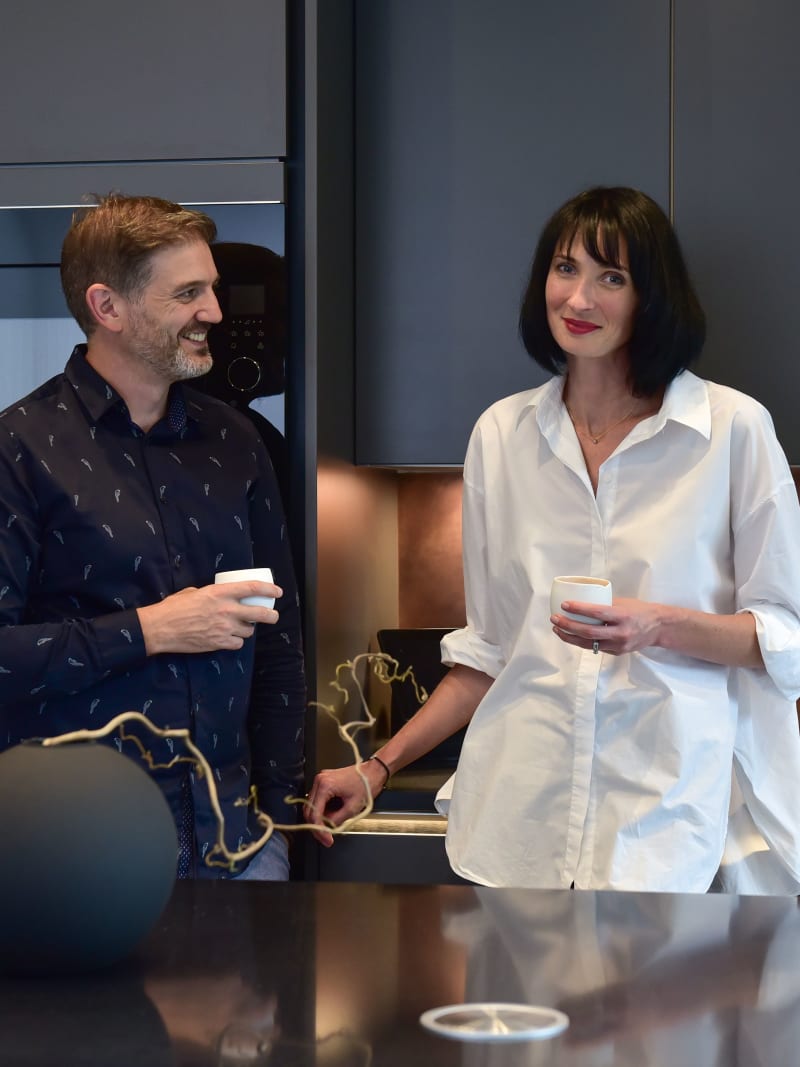
Why did you choose Magnet?
We were drawn to the colour selection and the quality of the product that Magnet offered. We had a fantastic experience with our kitchen designer and store manager, and we found them to be both reassuring and encouraging throughout our journey.
What advice would you give to a new kitchen buyer?
Don’t be afraid to change your mind, be patient and take your time. The most important thing we realised early on was that we didn’t want the kitchen design to dictate how we live in our space; we wanted our life to inform how the kitchen will work for us which our designer captured perfectly.
What's your favourite part of your new kitchen?
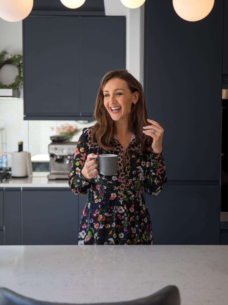
Our favourite feature of our kitchen would have to be our hidden coffee cupboard. Andrew is an absolute coffee nerd so we’re lucky enough to be able to enjoy beautiful morning coffees whilst having an allocated space to tuck away all the equipment.
How does your kitchen make you feel?
It makes us feel amazing. We really made our decisions very carefully. What we wanted to achieve is that feel of outside in, and inside out. It’s very important, especially in London where the space can be quite tight, to maximise it as much as we can.


The story
Anna and Andrew wanted to update their Victorian period home in a way that was respectful to the history and character of the property.
They opted for a continuous flow of grey tones to coordinate with the rest of their monochrome home – choosing shade, Charcoals, for their kitchen units.
They both love spending quality time with their family, so they sought after a central area to enjoy time with loved ones.
Plus, an open space to prepare and cook food and share beautiful dishes was a must.
The result was this beautifully dark and decadent kitchen, designed for them both to socialise and spend quality time together.
The couple had a strong vision from the start; an uninterrupted wall of units that would create a peaceful transition from indoors to outdoors.
A design that would catch the eye, so it would be the first thing that you’d see when you came into the house.
The sleek, handless cabinetry accompanied by a chic, brushed-bronze splashback achieved their desired look and we also incorporated a stylish breakfast bar within the island for added dining space.
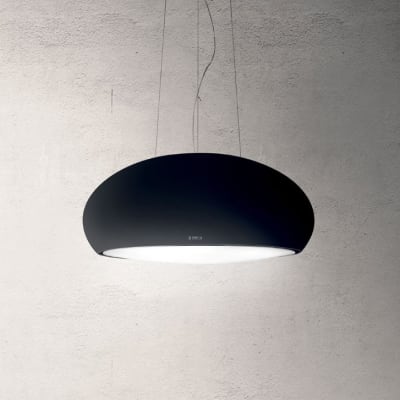
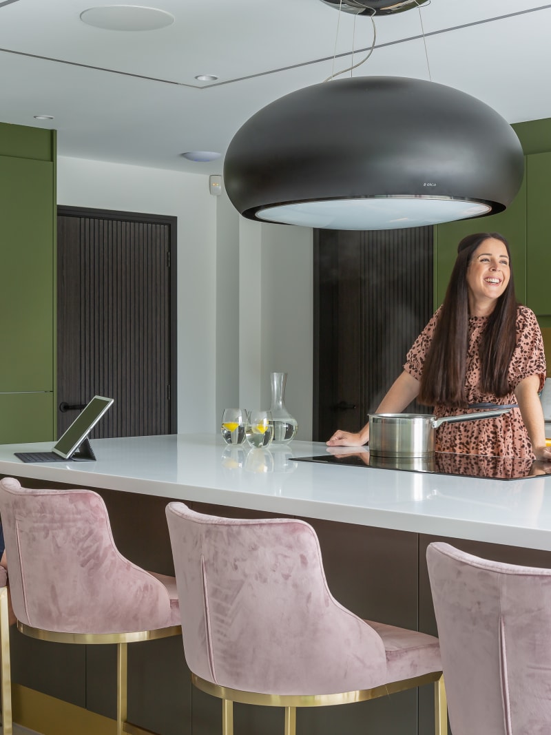
Anchoring the whole scheme, the matte black Elicia Hood completes the look to create a charming social space that the couple can be proud of.
About this kitchen
Layout
I-shape with island
Cabinet style
Handleless
Designer and Store
Imran & Howard, Blackhorse Road (Waltham)
Size
Medium
Discover customer kitchens
Designed by us, styled by you. See how our kitchens have been brought to life in our customers' homes.
Book your design appointment
-
Get an expert design and itemised quote completely free of charge
-
Your dedicated designer will walk you through the design process
-
We’re happy to offer design appointments in-store and online
-
Let’s start creating your dream kitchen!


